Monday, December 31, 2018

Page 11 Finished Illustration


I finished page 11 last night.  I'm quite happy with the results, especially the colors which scanned quite well.  This was fun to paint and the atmospheric perspective looks good.  The main challenge was softening the main fireball using opaques.  Opaque paint does not like to be blended using a wet brush.  You can use a damp brush but even then, the paint likes to form hard edges.  I will start painting page 12 tomorrow, I hope to have two more pages done before the winter break is over.

Saturday, December 15, 2018

Page Ten Finished Illustration


Finished page ten tonight.  Creating the digital file was a bit of a pain - I had to create a lot of correction layers to make it match the original as best I could.  All the colors lean towards a yellow-green.  What's interesting with this color theory is that turquoise appears blue.  The blue jeans on the cyclops is actually a turquoise color.  The cyclops in the center has the darkest values and the most saturated colors, making him the subject.  The fox is still high contrast but I decided he was a bit too small to be the subject of the painting.  In the next painting I will have lots of vibrant blues and violets.  It should be the most colorful illustration yet!  Stay tuned.

Thursday, November 15, 2018

Page Nine Finished Illustration


Finished the illustration for page nine tonight.  Surprisingly not a whole lot of edits to the digital scan.  The only colors that had to be adjusted were the yellow-oranges and magenta.  The color is punched up in this one whereas the first seven illustrations are fairly muted.  I did this by mixing in some primary cyan into the payne's grey/ burnt sienna paint that I use for the initial underpainting.  Depending on the color theory, I will mix different colors into the payne's grey when i do the underpainting from now on.  It certainly makes the illustration much more vibrant.  It is okay for the first few pages to be more subtle and muted since that is really the setup for the story.  The remaining pages should be more brighter particularly if they are exciting action scenes like this one.

Saturday, October 20, 2018

Page Eight Finished Illustration


Finished page eight tonight.  This illustration was fairly easy to render, except for the fox because of his small size and amount of detail.  Overall it was quite fun to paint, probably one of the more detailed pages out of the bunch.  This illustration really represents a D&D party - Barbarian (tiger), Thief (fox), Knight/ Fighter (rabbit aka Maximus) and Wizard (Raccoon).  I am aware that I am missing a cleric, I considered adding a fifth party member but it felt too cramped on the page.  I will start on page nine this week after I finish lesson plans.  Still moving at a steady pace, I am learning more and more with each illustration I create.

Wednesday, October 3, 2018

Page Seven Finished Illustration


I finished page seven tonight.  Fairly simple composition but it still took a fair amount of time to paint mostly because of the amount of detail in the treasure.  Not much prismacolor in this one, only a little bit of texture in the fur.  There is quite a lot of opaques in the foreground, especially on the coins.  I had no issues with the rabbit after scanning the illustration but the yellows in the gold were way too dark and too saturated.  I had to shift it to yellow-orange to match my original better.  Scanning artwork is always a little bit of a hassle because I almost always have to create a digital version with correction layers that better match the colors in my original.

Tuesday, September 18, 2018

Page Six Finished Illustration


I finished page six tonight.  I seem to be finishing these at a pace of one illustration every week and a half or so.  This probably means I won't have all of my illustrations done until sometime next spring.  Good news is that I am now getting a rhythm going and that usually means I will be able to speed up some.  This painting was fun and I am pleased with the results.  The main challenge as far as design was concerned was to make sure the bears pop off the trees and the rabbit pop off the bears.  There are two levels of grey behind the rabbit.

Sunday, September 2, 2018

Page Five Finished Illustration


I finished the illustration for page five tonight.  This one was a lot easier for me to think about in terms of design and color theory.  Initially I thought the brick background might be too busy but I fixed that issue by lightening the line art.  Not a whole lot of opaque paint on this one except for fur texture.  I start creating lesson plans for art classes this week.  I still plan on finishing at least one painting a week.  Saturday and Sundays will be used to create lesson plans.  We will see how things go as the school year progresses.

Friday, August 24, 2018

Page Four Finished Illustration


Here is the finished illustration for page four.  This one had a much more challenging composition since the background was not just flat, open space.  It was important to always be wary when painting the background around the rabbit and never go too dark.  I always paint these illustrations background to foreground.  As I was painting the background, I initially thought I went too dark.  It was not until I started painting with payne's grey on the rabbit that I realized that light fluffy colors cannot compete with the really dark pigments.  Overall it went well, I only wished I painted this a little faster.  So far it seems that one week is the time I need to be satisfied with a finished painting.  I would like to narrow that done to four or five days.  I start page five tomorrow!

Saturday, August 11, 2018

Page Three Finished Illustration


Here is the finished illustration for page three.  I used less prismacolor this time and a lot more opaque paints particularly on the water's surface.  I also glazed some light washes on top of the opaques to make it look like it is reflecting the color of the sky.  This painting was an interesting challenge, especially thinking about color theory.  Most of the colors are very neutral except for the blue green in the rabbit's eye.  A lot of the colors had to be created by mixing pigments.  In order to get the right mixture I had to jump across the color wheel and mix colors together since certain pure pigments were not available to me ( phthalo green and green gold ).  It worked out fairly well and I am pleased with the results.  Onto page four!

Tuesday, July 31, 2018

Page Two Finished Illustration


Here is the finished illustration for page two.  I painted this on vellum bristol using golden fluid acrylics and I did a little bit of texture using prismacolor.  I also had to do some minor digital edits to make the colors match my original as close as possible.  Overall it turned out well.  This painting took me a little over three days to complete.  At this rate I hope to have most if not all the pages painted by the end of December.  I do have to teach classes this fall and lesson plans will certainly occupy most of my time.  It will be a challenge to balance my time between creating quality lesson plans for my classes as well as painting the illustrations for my book. 

The good news is that I do not start teaching until after labor day so I have a little over a month to work on my book.  We shall see how many pages I manage to complete.  Onto page three!  FYI:  Just in case you are wondering where page one is, I am painting these in the order I drew them.  Page two was originally page one.

Thursday, July 26, 2018

Edited Line Art and Color Theory

So after a critique, I made some changes to the line art.  The changes were mostly minor, the only big change was to my cover.  In my original cover, it looked less like a cover and more like an interior illustration.  Also it looked like the hero was about to get his butt whooped. 


In my new cover the hero is drawn much larger and he is standing tall.  


I also needed an official first page since a book cannot begin with the first page on the left-hand side.  I kept the line art for the first page very simple:


Page three needed some edits because on page four the hero is also chopping something with his sword.  Visually it looks better if he is preparing to swing on one page, followed by chopping on the next. 


The new line art has the hero about to chop with his sword.  Some might think this is done to make the book less violent, but it really was done for visual storytelling purposes.


You can see that the story flows better into page four which is the hero chopping something with his sword:


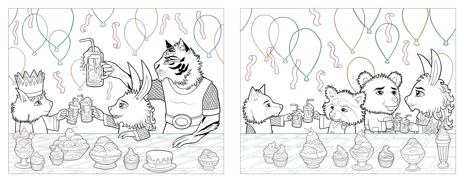
The last pages to edit were the final two pages.  The initial critique was that the desserts looked like "conveyor belt sushi" because they were all neatly lined up:


Now for most of you this is an easy solution - just move the desserts around.  For me it was the most difficult editing I had to do because I am very picky about my line art and I see tangents everywhere.  I did my very best to enlarge some things and move stuff around.  I had to re-ink some of the desserts because when you shrink or enlarge inks, they can become fuzzy.  Anyways, I think the edited pages do look better in the end:


Brian Stelfreeze is my teacher and he is the one who provided this critique.  He also showed me a cool way to go about planning color theory for a book.  What he showed me was to use color "swatches" where the large rectangle is the dominate color on the page and the other smaller boxes are the other major colors.  Brian says that the color theory for a book should play out like a song, with verses and chorus' and a blistering solo.  Some parts of a song should stand out, while others should be quieter.  It was a good way to get me thinking about the overall color theory for the book and what pages should stand out so I can drive the message of the story home.


Monday, June 4, 2018

Children's Book Line Art!! All pages finished!

Hello Everyone!  So I'm happy to report that all the line art for my book is finished!  The next step is to start painting with acrylics as well as some coloring using prismacolors.  I plan on going to the art store to get some vellum bristol so I can begin printing out the line art and start painting.  Each image is 14.5 inches by 11.5 inches with a quarter inch bleed.  There are 26 illustrations total (two are double page spreads) and I am hoping to get at least one done every few days.  Painting and coloring is always quicker for me so I am hoping to have all the illustrations done by the end of the year.  The line art is posted below, the first four images are the front cover, back cover, dedication and title page.