For this painting, it was crucial that the planning was carefully thought out because there were many elements in the composition that needed to be separated from each other. To separate all the elements, maximum contrast is very important. The areas in the composition that needed separation were the rabbits, the wolf, the large tree, the grass, the trees behind the wolf and the treeline in the distance.
You can see my initial idea in the thumbnail. I changed the pose of the wolf character because I thought it felt stiff and awkward. By changing the pose I altered the story from a protagonist searching for a rabbit assassin, to a protagonist being aware of one rabbit but oblivious to the danger behind him.
This is the reference I looked at when I created the line art and when I started my painting. I liked the otter sitting in grass because it shows what long grass looks like when something is sitting in it. The trees, weapons and rabbits I drew from my imagination.
My initial drawing was somewhat of a disappointment - the turns/angles on the armor did not look right and the wolf's head was way too low.
Here in the inks you can see I altered the armor some and I raised the wolf's head a little more.
As I mentioned before, contrast is very important especially when there are a lot of elements in the composition that need to be separated from each other. Black, white and grey comps are crucial for this part of the planning. I knew that I wanted the large tree with the rabbit as well as the wolf to register as black. The other two trees and the grass I wanted as a dark grey. All other elements in the distance needed to be light grey or white.
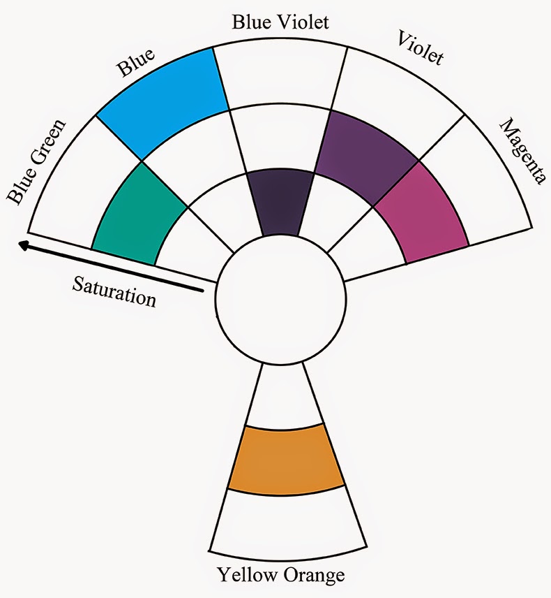
After I had a good understanding of the overall values in the composition, I began thinking about color. This color theory is similar to the one I used on my phoenix painting except I have used pure blue on the subject (wolf's eye) instead of turquoise. I like to use color theories like this a lot because with yellow-orange, I can get maximum contrast and it looks good against neutral blue-violets.
Once I knew the color theory I intended to employ, I was ready to colorize my lines. I printed this one out and started painting but after five hours of work, I realized that the wolf's head was still too low so I went back to the line art for corrections.
When I draw wacky cartoon characters, it is still important that they have believable proportions. I could not continue painting knowing that the wolf's head looked sunken into his shoulders. You can see in this image that I raised his head about half an inch. I also got rid of one the plates of armor on his left arm (axe arm). That plate of armor is flat and should not curve around or be visible. The change on the armor was a minor nitpick but I felt it had to be done.

When I started my painting, I first did an underpainting on the wolf, the grass, the large tree and the rabbit in the foreground. I only used payne's gray on those areas. I then used dioxazine purple on the same areas again. I also used dioxazine purple to do an underpainting on the other two trees and the second rabbit. Once I had the underpainting established, I began working background to foreground using light transparent veils of paint and steadily the values in the foreground became darker. Opaques were of course the final step in the painting and ninety percent of them are on the wolf character. I used a little bit of opaque paint on the rabbits' eyes to make them appear to glow some. I glazed pure phthalo blue over titanium white for the wolf's eyes.

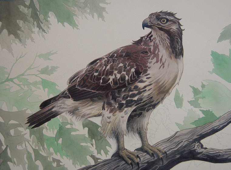
Here is the least successful of the two paintings but I figured I would discuss it anyway. As far as contrast and value are concerned, the painting does well. But the color theory falls apart in some places mostly because I chose red for my subject. Red is a tricky color because it does not like going too light nor does it like going too dark. On a scale of one to ten, red likes staying at a five. It is difficult to get high contrast with a stubborn color but I gave it my best effort.
I love the character Rocket Raccoon. I had to create an illustration of him after I saw the movie. HAD too. I sketched this thumbnail in my sketchbook. I wanted to go a humorous and violent route with the theme.
Here is the reference that I looked at. I wanted to look at real raccoons when drawing and painting Rocket's head and tail. For the costume I looked at some concept art from the movie. I looked at some machine guns and rifles, but I mostly designed them using my imagination. I looked in the mirror and posed when I drew his arms. The rest of the elements in the composition all came from my head.
Here is my pencil drawing followed by my inks. Before I inked it, I did shrink Rocket's head since it looked a little too big.
Here is my comp, color theory and colorized line art for the painting. I think having yellow green in the background was fine, it just needed to be desaturated a little more. I also think that it would have been better to use another color like magenta or blue for the subject of the piece.
Overall I have learned a lot from creating both paintings. Despite my disappointment with the rocket raccoon painting, I am still glad I took the leap and tried a more challenging color theory. This does not mean I am going to avoid the color red in future paintings, it just means I need to plan more carefully if I wish to employ it in my subject.