Thursday, May 23, 2013
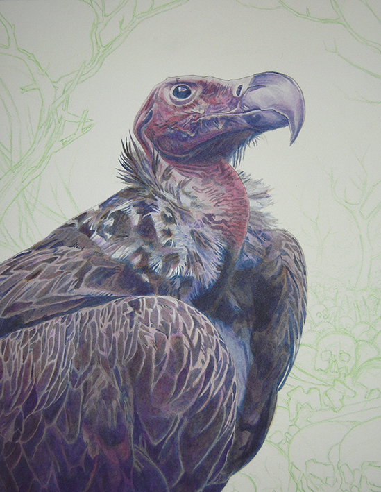
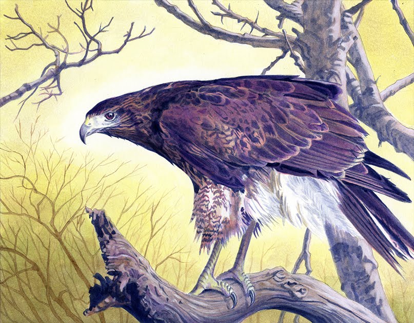
Vulture Painting
Tuesday, April 23, 2013
Finch Acrylics and Process
I decided to paint a finch this time, mostly because I was tired of painting oak leaves. Almost every bird painting I have done has oak leaves in the composition and it was getting old. This particular bird looks good amongst desert flora so I looked up “desert flower” and “cactus flower” to find some cool background reference. I decided to go with a blue-violet versus yellow-orange color theory again but I used it in a way that was much different. I used payne’s grey but I stayed away from primary cyan. I decided there is enough blue in payne’s grey to get the job done. I also stayed away from turquois, so mostly I used the analogous colors from blue-violet to magenta and yellow orange which is on the opposite side of the color wheel.
You can see I made some changes to the drawing if you look at the finished painting. When I held my drawing up to the mirror the petals in the upper right hand corner looked odd – they were too big. You can see in the painting that I shrunk those petals significantly. It is really important to check your composition before starting the underpainting. Holding your drawing up to the mirror is an excellent way to check compositional issues that you may have.
I used three brushes for this painting – two synthetic rounds (8 & 10) and a large 16 soft round for doing gradient washes. The 16 soft round brush is called a “Neptune” brush. It can hold a ton of water and it is very easy to get a soft, air-brushed feel with it. The underpainting is done in payne’s grey and primary magenta. You can see I painted the background with magenta instead of using an earth tone. I really wanted to push the absolute separation of background and foreground elements in this piece. By only using warm colors in my background, I accomplish this pretty easily. When doing this underpainting, I used my two synthetic rounds. There are mostly hard edges although I did apply some light gradient washes on the foreground.
When I really start to lay in color, I use dioxazine purple on both background and foreground elements. I am always consciously aware of maintaining the white of the board around the bird’s head in which his eye is my subject. Again, contrast and color are important so everything around his head needs to be the highest contrast – black and white. As we move away from the subject towards the edge of the picture plane, it needs to become lower contrast. I keep this in mind when I do my gradient washes.
I wanted his belly to be more separated from the background so I did a few gradient washes with dioxazine purple to accomplish this. Doing so brought the bird more forward; I needed his lower underbelly to be nearing a dark grey. Again, I figured this out by looking at my painting in the mirror and when I did, the value problems became more apparent.
Here I really lay in the color. Attacking the background, I use my large 16 soft round to do multiple gradient washes with vat orange and primary yellow. I apply vat orange first and I am careful to thin out the paint so as I move towards the subject, it is mostly water by that point. You must always be wary of maintaining high contrast around the subject. The vat orange and primary yellow washes end up neutralizing the magenta quite a bit, which is alright, the only true saturated color will be in his eye. Looking at my reference, I use primary yellow to neutralize a few areas on the bird. I am thinning out the yellow and applying it very lightly when I do this. I then go back in with magenta and do the same thing.
Here in the finished scan, you can see that I have done a considerable amount of opaques both on the foreground and background. I also deepened some of the dark areas with payne’s grey and dioxazine purple. When applying the opaques, I am using mostly titanium white and a little bit of primary yellow. I pay close attention to my reference and pop things that need a little more contrast. I added some acrylic flow release to my smaller jar of water to make titanium white flow a little easier. When I added the highlight in his eye, I first used nothing but titanium white then I glazed on a little bit of alizarin crimson followed by some vat orange. In my reference his eye is nothing more than a black orb which doesn’t make for a very interesting subject. Adding reflections and saturated color is a subjective decision to make a much more interesting composition.
Friday, March 22, 2013
Crow Acrylic Process
For this painting of a crow, I wanted to use a color theory for a blue-violet foreground that did not utilize yellows and oranges in the background. I decided to go with a purple versus yellow color theory. On one side of the color wheel we have blue, blue-violet, violet, magenta and red. On the opposite side is the complement which is yellow. The crow is extremely dark – almost black so I knew violets and blues would do the trick. I wanted the crow to be bluer near the bottom of the picture frame. I decided to paint the leaves and background using reds and magentas. I used violet on the darkest parts of the leaves.
The first stage as always is the drawing. It is at this point that composition, value and color are already running through my mind. I transfer the bird that I am painting by rubbing graphite on the back of the reference photo. When doing the transfer, I prefer using a colored pencil. In the past I used a ball point pen but I find that it can dent the surface of the board especially if you happen to be heavy handed. I am sure to do a very loose transfer – getting all the important information and high contrast areas. I draw the rest of it using a 0.5 and 0.3 mechanical pencil.
The second stage is always the underpainting and as always I like to start with the darkest area first – the crow. I use payne’s grey for the underpainting using mostly rounds – synthetic brushes for harder edges and more natural, softer brushes for the washes and soft edges. When I am using reference, I am sure that I keep the reference photo about half arms distance away forcing me to consider overall shapes and values instead of details.
Unlike previous bird paintings, for this one I decided to go ahead and bring the foreground to more of a finished state before heading over to the background. I start laying in gradient washes of primary cyan using my softer, natural rounds. The pigment is more concentrated and saturated near the bottom of the picture frame and I slowly thin it out as I near the head of the crow – rinsing and diluting the pigment in the brush as I move up. I do two of these gradient washes.
I attack it with dioxazine purple in the next stage; using it basically the same way I used payne’s grey in the underpainting. It is at this point that paint now covers the entire bird except for the very brightest of highlights in his beak and eye.
In this next stage, I really begin laying in the color. I am mostly using payne’s grey and carbon black. I use carbon black on the absolute darkest areas and I also use it to neutralize color. When I use it as a neutralizer, I am careful to thin it out with more water in the brush. Carbon black is a good neutralizer because unlike payne’s grey, things do not become more blue as you add it. Payne’s grey is great but I find that as you layer it on a surface, it can become an ugly, saturated ultramarine blue if you over do it. I also did a couple more light gradient washes of primary cyan to beef up the blue color in his feathers. At this stage I also lay down some hansa yellow medium and primary yellow in his eye. I use dioxazine purple to control the level of saturation of yellow pigment. In this instance, I wanted a much more neutral – brownish yellow.
Now I am ready to begin the underpainting on the background. Because I know I want the leaves to be red, I use alizarin crimson hue to do the underpainting.
When I am ready to do my gradient washes, I use pyrrole red. I do many washes using this color but I am careful to thin it out and load my brush with plenty of water. I am sure to maintain high contrast around the head of the crow – it is pretty much the white of the board that is seen in the finally scan. I also paint some very light and very flat leaf-like shapes to give some more depth.
Here in the finished scan, you can see that I did some more rendering on the leaves – adding more leaf-like shapes, gradient washes and deepening the values/ details with dioxazine purple. But main thing is finishing up with opaques in his eye. There are opaques on some of his feathers and around his beak, but I mostly focused on his eye and getting the highlights where I wanted them to be.
Tuesday, March 5, 2013
Owl Acrylics
For this painting, I originally wanted to do a blue green vs red orange color theory. I decided a muted yellow green vs a dull red orange was a better route. Unlike the previous bird paintings, this one has quite a lot of opaques on the bird, particularly on his light feathers and in his eye. The only pure color is in his eye where I put some saturated yellow green (green gold). I also used some alizarin crimson and pyrole red to get some brighter reds in the leaves. Although the bird is a a dark yellow green, the color I first used after the under painting was turquois (phthalo). It slowly shifted and became muted as I layered dioxazine purple and green gold on top of it. Anyways, for the next painting I will do a more in depth blog post, I forgot to take progress photos on this owl.
Friday, February 15, 2013
Falcon Acrylic Process
I thought I'd post about my process behind these wildlife paintings I have been doing. The materials and tools of choice are 4 ply bristol with a vellum surface, an 8 round synthetic brush, a much softer 12 round (more natural fibers I think), an oval wash brush and golden acrylics (both fluid and tube). I use two water containers - one larger one for rinsing and a smaller one to make the pigment flow better. This also keeps my smaller container a clean source of water.

I use the color wheel and plan out my composition very carefully. In this case, I'm using a yellow-orange vs blue-violet color theory. I utilize all the colors from blue-green to red-violet in this falcon painting. Controlling the value and saturation of these colors is important so I can direct the viewer where I want him/her to go. I need to think about saturated and desaturated colors carefully otherwise I will get a muddy mess. Also when thinking about my color theory, I also consider my black, white, grey composition. You get black, white and two levels of grey to create a composition. One of if not the most important part in planning is this step. Fortunately, for most of these wildlife paintings, my foreground has the darkest values and my background is high key. This makes the black, white, grey composition very easy. I know that I will have the darkest part of the bird against the absolute white of the board making it the highest level of contrast. This makes it very easy to direct the viewer using contrast alone.
Always the first stage of any painting for me is the drawing. Really the drawing is nothing more than a guide so I am not painting blind. I am simply looking at my reference and finding hard edges or separations - high contrast areas that are in focus and not fuzzy. I prefer drawing with mechanical pencils because I'm not fond of sharpening them and it’s a lot cleaner. After I am done with the drawing I always scan it just in case I mess up and need to print a copy on another sheet of bristol. Before painting, I always roll over it with a kneaded eraser to pick up excess graphite.
When I’m finally ready to paint, the first step is always the under painting. Normally when painting with acrylics, you want to paint background to foreground, dark to light. With these bird painting, since I know that my foreground is darkest, I like to start on the bird first. I find it easier to get and maintain high contrast this way. I think it depends on the person, different people may find it easier to start on the high key background first. The only color I use when painting the dark foreground is payne’s grey. It may seem very dark but it is only because your eye is comparing it to the white of the board. After you start adding color, it is easier to see that what you believed was dark is actually a medium grey.
When doing the under painting for the background, I like to use a warm earth tone, in this case – burnt umber. I use burnt umber because I know that my background will have warm color and also it is nowhere near as dark as payne’s grey. This creates that separation between background and foreground.
Now I’m finally ready to lay in some color and the first step for this painting is a wash of primary cyan over the bird’s dark feathers. I use my softer brushes ( 12 round and oval wash) to do this. My smaller synthetic is better for hard edges, opaques and details.
After adding the primary cyan, I use dioxazine purple basically the same way I used the payne’s grey. In this step, it is mostly on the under belly of the bird. I used both round brushes for this stage to get soft and hard edges. I also did some soft gradient washes on his under belly. I find that you can do gradient washes in two different ways – the first is to add water to the board and then add paint, the other is to load your brush with a lot of water and paint and gradually thin it out. I find that the first step can be more unpredictable and difficult as far as controlling the pigment. Also you have to wait longer for the board to dry and the pigment might bleed into areas you did not want it to. I prefer using the second method because I have much more control over the pigment. It requires much more speed and finesse since you have to add the initial wash, rinse and dry your brush, thin out the wash and so on.
Now I really begin to pile on the color. I begin with the under belly of the bird first using vat orange (same way I used dioxazine purple). Then I do some washes with primary yellow. The result is a neutral tone since the dioxazine purple and yellow complement each other. I also use the vat orange and primary yellow on the birds beak and around his eye using my synthetic round. I deepen some of the darker feathers using dioxazine purple and payne’s grey. I also deepen the values further on the bird’s under belly using some gradient washes of dioxazine purple. Lastly, I lay in some turquois (phthalo) on his eye.
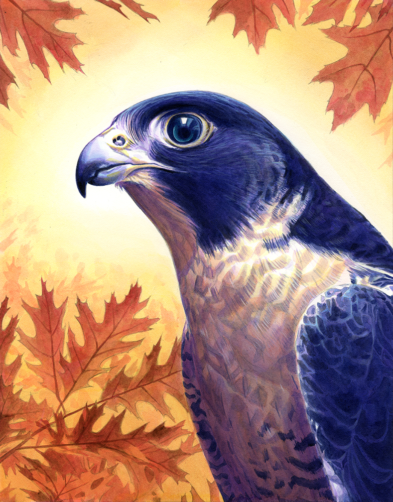
As I mentioned before, since I am painting against the white of the board, values that I believe to be dark are actually more of a medium grey. And in this case, the values on the bird’s dark feathers need to be deepened further still. I use payne’s grey but I will also use some carbon black. Payne’s grey is basically carbon black with some blue added to it. For some reason acrylic payne’s grey is much more blue than its watercolor cousin. Because I did not want more blue pigment in his feathers, I decided to use carbon black. You have to be careful with carbon black because it goes dark very fast. It is important to know where you want to place it before you begin using it.
When I start laying in color on the background, I first do a wash over the leaves using primary magenta. I use both rounds to do this. After the initial wash of magenta, I then use my synthetic brush the same way when I did my under painting. Using warm colors, it is impossible to go as dark as the values on the bird and so I get that contrast and separation. Still, I am careful to thin out my pigments so I do not go too dark.
Last step for the background is to use my soft brushes to do some gradient washes using burnt umber, vat orange and then primary yellow. This creates a fuzzy halo around the head of the bird where I want to direct the viewer’s attention. I used my small synthetic brush to do some light leaf-like shapes around the halo still being carefully not to go too dark.
The last and final step of the painting is opaques on the bird. Here in the finished scan you can see I hit some of his feathers very lightly but most of the opaques are on top of his head and in his eye. I use my synthetic small round to do this. I think it is better to do opaques with a brush that has some “spring” to it. Also opaques seem to destroy brushes faster so it is always better to use a synthetic. I put a little bit of pure turquois in his eye for the finish.