I thought I'd post about my process behind these wildlife paintings I have been doing. The materials and tools of choice are 4 ply bristol with a vellum surface, an 8 round synthetic brush, a much softer 12 round (more natural fibers I think), an oval wash brush and golden acrylics (both fluid and tube). I use two water containers - one larger one for rinsing and a smaller one to make the pigment flow better. This also keeps my smaller container a clean source of water.


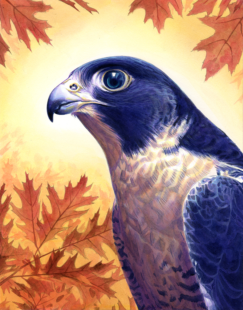
I use the color wheel and plan out my composition very carefully. In this case, I'm using a yellow-orange vs blue-violet color theory. I utilize all the colors from blue-green to red-violet in this falcon painting. Controlling the value and saturation of these colors is important so I can direct the viewer where I want him/her to go. I need to think about saturated and desaturated colors carefully otherwise I will get a muddy mess. Also when thinking about my color theory, I also consider my black, white, grey composition. You get black, white and two levels of grey to create a composition. One of if not the most important part in planning is this step. Fortunately, for most of these wildlife paintings, my foreground has the darkest values and my background is high key. This makes the black, white, grey composition very easy. I know that I will have the darkest part of the bird against the absolute white of the board making it the highest level of contrast. This makes it very easy to direct the viewer using contrast alone.

Always the first stage of any painting for me is the drawing. Really the drawing is nothing more than a guide so I am not painting blind. I am simply looking at my reference and finding hard edges or separations - high contrast areas that are in focus and not fuzzy. I prefer drawing with mechanical pencils because I'm not fond of sharpening them and it’s a lot cleaner. After I am done with the drawing I always scan it just in case I mess up and need to print a copy on another sheet of bristol. Before painting, I always roll over it with a kneaded eraser to pick up excess graphite.

When I’m finally ready to paint, the first step is always the under painting. Normally when painting with acrylics, you want to paint background to foreground, dark to light. With these bird painting, since I know that my foreground is darkest, I like to start on the bird first. I find it easier to get and maintain high contrast this way. I think it depends on the person, different people may find it easier to start on the high key background first. The only color I use when painting the dark foreground is payne’s grey. It may seem very dark but it is only because your eye is comparing it to the white of the board. After you start adding color, it is easier to see that what you believed was dark is actually a medium grey.

When doing the under painting for the background, I like to use a warm earth tone, in this case – burnt umber. I use burnt umber because I know that my background will have warm color and also it is nowhere near as dark as payne’s grey. This creates that separation between background and foreground.

Now I’m finally ready to lay in some color and the first step for this painting is a wash of primary cyan over the bird’s dark feathers. I use my softer brushes ( 12 round and oval wash) to do this. My smaller synthetic is better for hard edges, opaques and details.

After adding the primary cyan, I use dioxazine purple basically the same way I used the payne’s grey. In this step, it is mostly on the under belly of the bird. I used both round brushes for this stage to get soft and hard edges. I also did some soft gradient washes on his under belly. I find that you can do gradient washes in two different ways – the first is to add water to the board and then add paint, the other is to load your brush with a lot of water and paint and gradually thin it out. I find that the first step can be more unpredictable and difficult as far as controlling the pigment. Also you have to wait longer for the board to dry and the pigment might bleed into areas you did not want it to. I prefer using the second method because I have much more control over the pigment. It requires much more speed and finesse since you have to add the initial wash, rinse and dry your brush, thin out the wash and so on.

Now I really begin to pile on the color. I begin with the under belly of the bird first using vat orange (same way I used dioxazine purple). Then I do some washes with primary yellow. The result is a neutral tone since the dioxazine purple and yellow complement each other. I also use the vat orange and primary yellow on the birds beak and around his eye using my synthetic round. I deepen some of the darker feathers using dioxazine purple and payne’s grey. I also deepen the values further on the bird’s under belly using some gradient washes of dioxazine purple. Lastly, I lay in some turquois (phthalo) on his eye.

As I mentioned before, since I am painting against the white of the board, values that I believe to be dark are actually more of a medium grey. And in this case, the values on the bird’s dark feathers need to be deepened further still. I use payne’s grey but I will also use some carbon black. Payne’s grey is basically carbon black with some blue added to it. For some reason acrylic payne’s grey is much more blue than its watercolor cousin. Because I did not want more blue pigment in his feathers, I decided to use carbon black. You have to be careful with carbon black because it goes dark very fast. It is important to know where you want to place it before you begin using it.

When I start laying in color on the background, I first do a wash over the leaves using primary magenta. I use both rounds to do this. After the initial wash of magenta, I then use my synthetic brush the same way when I did my under painting. Using warm colors, it is impossible to go as dark as the values on the bird and so I get that contrast and separation. Still, I am careful to thin out my pigments so I do not go too dark.

Last step for the background is to use my soft brushes to do some gradient washes using burnt umber, vat orange and then primary yellow. This creates a fuzzy halo around the head of the bird where I want to direct the viewer’s attention. I used my small synthetic brush to do some light leaf-like shapes around the halo still being carefully not to go too dark.

The last and final step of the painting is opaques on the bird. Here in the finished scan you can see I hit some of his feathers very lightly but most of the opaques are on top of his head and in his eye. I use my synthetic small round to do this. I think it is better to do opaques with a brush that has some “spring” to it. Also opaques seem to destroy brushes faster so it is always better to use a synthetic. I put a little bit of pure turquois in his eye for the finish.
No comments:
Post a Comment