
I was finally able to make a return to some fantasy work after building up my confidence producing a bunch of nature paintings. High fantasy and sword & sorcery have always been an interest of mine so I’ve decided to do some armored figures more specific to those genres. My friend Geoff helped pose for this painting of a warrior leaning against a tree. I wanted to incorporate more of a story in this piece and even though the warrior is the subject, if you look around you can see the mangled body of an enemy. It is true that it could have just been the warrior leaning against a tree to cool off in the shade. By adding a fallen foe in the distance, another story telling element is incorporated to make the piece more interesting to the viewer if he or she decides to look at other details. Despite this, upon initial glance all attention is directed to the saturated green visor of the warrior. My color theory for this was the analogous colors ranging from yellow-green to blue-violet and the warmer red-orange across the color wheel.
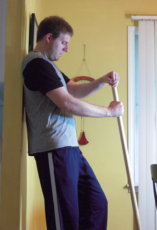


I shot most of my reference including the trees and leaves. When I shoot reference, I also like to zoom in on the hands and face since those will be the most detailed areas of the painting. The armor and weapon elements I googled so I could get a solid idea of how light reflects off of steel. To mimic the sword, I just bought a dowel rod from home depot. I then got Geoff to put on clothes that could give the appearance of a chain shirt or armor. Setting up the lighting can be tricky, but it is always my goal to make certain that I can see interesting core shadows. I find it is easiest to do this with one strong light source although I will sometimes add a secondary light source as well.

When I drew the figure, I really had to think carefully about how the plates of the armor would wrap around his frame. Because his entire body is covered in steel, it was important that it looked believable. The only real modification to the proportions of the figure was that I shrunk his head and enlarged the hands. A smaller head gives more heroic proportions.

Before I started the underpainting, I did a light wash of paynes grey over all my foreground elements to make certain I was separating them from my background. This is mostly done to trick my eyes into going darker when I paint. Whenever you paint on a white area, everything looks dark. By painting on a grey area, subconsciously you will paint darker and thus have much more contrast between background and foreground elements. As I have mentioned before, I am more comfortable starting on the darkest area of my composition first. In this case that happens to be the foreground. That does not mean that you have to approach it the same way. If you are more comfortable always starting on the background first, then that is what you should do. I painted most of the underpainting using the more stiff rounds so I could get the hard edges of the armor. I also did a little bit of splattering with a tooth brush to give his armor a more beat-up look. Before doing any splattering, I cut out a stencil with tracing paper to protect areas I wanted to keep clean.

At this stage I am ready to apply some color. I mostly stuck with dioxazine purple on the
figure; applying it very lightly. I used
burnt umber on the tree and phthalo green on the leaves. Phthalo green can be very saturated and
over-powering so I thinned it down before applying it. It is only after adding color that I could
see that the values I thought were dark, were actually more of a grey and that
I had to go darker still. After I was
satisfied with the base colors I added, I then masked off the background. You can see in this image that it has a
yellowish appearance. I added it very
generously so it would be easier to peel off and my background would be
protected.

After the liquid mask dried, I then applied some gradient washes of turquois starting from the top of the image and going down to the shoulder region. I also did some gradient washes of dioxazine purple and paynes grey from the bottom upwards. I decided to also add a gradient wash of alizarin crimson on the claymore and I did some splattering with my tooth brush as well. Removing the liquid mask is done very easily using a rubber cement block. Once you get it started you can pull it off using your fingers.

After adding all the base colors and doing multiple gradient washes, I could just tell that the foreground was nowhere near dark enough. I went back in with paynes grey and deepened a lot of the shadows.

When I painted the background, I was very careful not to use any paynes grey so I could get maximum contrast. I used burnt umber on the trees and grass but kept it out of the sky. When I did my gradient washes of alizarin crimson and vat orange, I went right over areas of the foreground since I knew it would not affect it too much. It desaturated some of the leaves and added some interesting warm colors to the gauntlets. I used a little bit of green gold on the trees and grass. It ended up being a little too saturated so I toned it down by doing a gradient wash of dioxazine purple. You can see that in these photos, the alizarin crimson appears a lot more orange than in the final scan. Not sure why this happens, I guess the vat orange overpowers it when I shoot a photo.

At this stage, I was bringing things to a more finished state by darkening my foreground with paynes grey even further. I did a couple of gradient washes of paynes grey going from the bottom upwards just on the foreground elements. Some areas of the background I darkened using dioxazine purple.
You can see all the opaques I did in the finished scan of the painting. I kept most of the opaques around his head, arms and hands. I thinned out the opaques as I moved away from those areas. The face is the most important and to really force the viewer in that direction, I was certain to super saturate his visor using phthalo green. There is pure color on the visor as well as pure titanium white highlights to give maximum contrast.
No comments:
Post a Comment