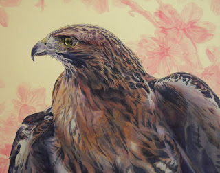
Before I start a painting, I always think about where my darkest values will be with the understanding that I will only use payne’s grey and dioxazine purple in those areas. The lightest areas should be devoid of dark pigments to give as much contrast as possible. Wherever I am not using payne’s grey or dioxazine purple I have to use other pigments to get those grey values. Those particular pigments will vary depending on the color theory I choose to employ. When you view a painting in thumbnail form or look at it from a distance and squint at it, these overall values should become apparent. This is called black, white and grey composition. In the case of this red tailed hawk; when squinting at the painting the darkest values are on the hawk itself (foreground). The background contains grey and absolute white. After I am sure of where the darkest and lightest values are, only then do I take out the color wheel.
In the case of this hawk, I knew I wanted to use payne’s grey, dioxazine purple, vat orange, primary magenta, primary yellow and green gold on the hawk. Since my background only consisted of light grey and absolute white values, I knew the pigments I could use would be much more limited. Because of the color theory I decided on, I chose primary magenta, primary cyan and green gold for the background elements. With that understanding, I was ready to do a line drawing. You can see in the scan that I drew the cherry blossoms using a red colored pencil (carmine red). I did this because I knew that the underpainting for the background would be done with primary magenta. Also graphite is way too dark – requiring some erasing after completing the background.
I prefer painting the darkest areas first, whether or not they are in the background or foreground doesn’t matter to me. Because I knew my hawk would be dark, I put a light wash of payne’s grey over the dark areas of the drawing. This was done to force me to paint darker because on a pure white surface, every mark you make will appear dark. By putting a wash over the dark areas of a drawing, I end up wasting less time to obtain those dark values. Otherwise, you might end working on an underpainting and then going back over it a second time to get the darker values in your comp.
At this stage of the painting, I started to lay down some transparent color. Always when this is done, several things become apparent – the underpainting is not dark enough and the added color flattens the image. The first color I laid down (vat orange) seemed to make the image look garish and it was not until I started adding dioxazine purple that the image calmed down. I used vat orange because I knew it would become neutralized. I always prefer using color over earth tones whenever possible. Colors that interact to form neutrals generally look better than earth tones like burnt umber.
As I mentioned, the image was flattened after putting down some color. Because of this, I went back in with payne’s grey and deepened the dark areas of the hawk. I also started to lay down some opaques to pop areas of the feathers and to brighten his eye. There should always be a subject (area of focus) for a painting. In this case, I chose to make the hawk’s eye glow using titanium white at first, followed by glazing color on top of those opaques areas. By glazing color over titanium white, you can get the most saturated color because the pigment is not interacting with transparent colors underneath. The color “floats” on top of the opaque paint and looks brighter being surrounded by desaturated and dark areas.


